Ever wonder how to take your research data from “meh” to “heck yeah”? If you’re diving into the world of SPSS, you’re already one step ahead in understanding your dataset. But here’s the thing: while SPSS is known for its sturdy basic charts and graphs, there’s a whole world out there that goes way beyond those cookie-cutter visuals. Today, we’re gonna chew the fat about how you can level up your SPSS data visualizations and really make your analysis pop.
Starting With the SPSS Basics
Now, SPSS has been around for a minute, and most of us have started off by playing around with the default bar charts, histograms, and pie charts. These basic charts are kinda like the training wheels on a bike—they get you rolling, but they won’t win you any style points in a big presentation. Y’all might have experienced the drag of using those old-fashioned charts in a report, feelin’ like you’re missing something crucial. And honestly, it ain’t all that exciting when you’re trying to convey nuanced findings.
The beauty of SPSS, however, is that it’s loaded with options to tweak your charts. Whether it’s customizing colors, fonts, or adding error bars, there’s a ton of under-the-hood magic waiting to be discovered. And let’s be real, sometimes it’s those little details that can make a huge difference in how your data is perceived.
Diggin’ Deeper: Beyond the SPSS Defaults
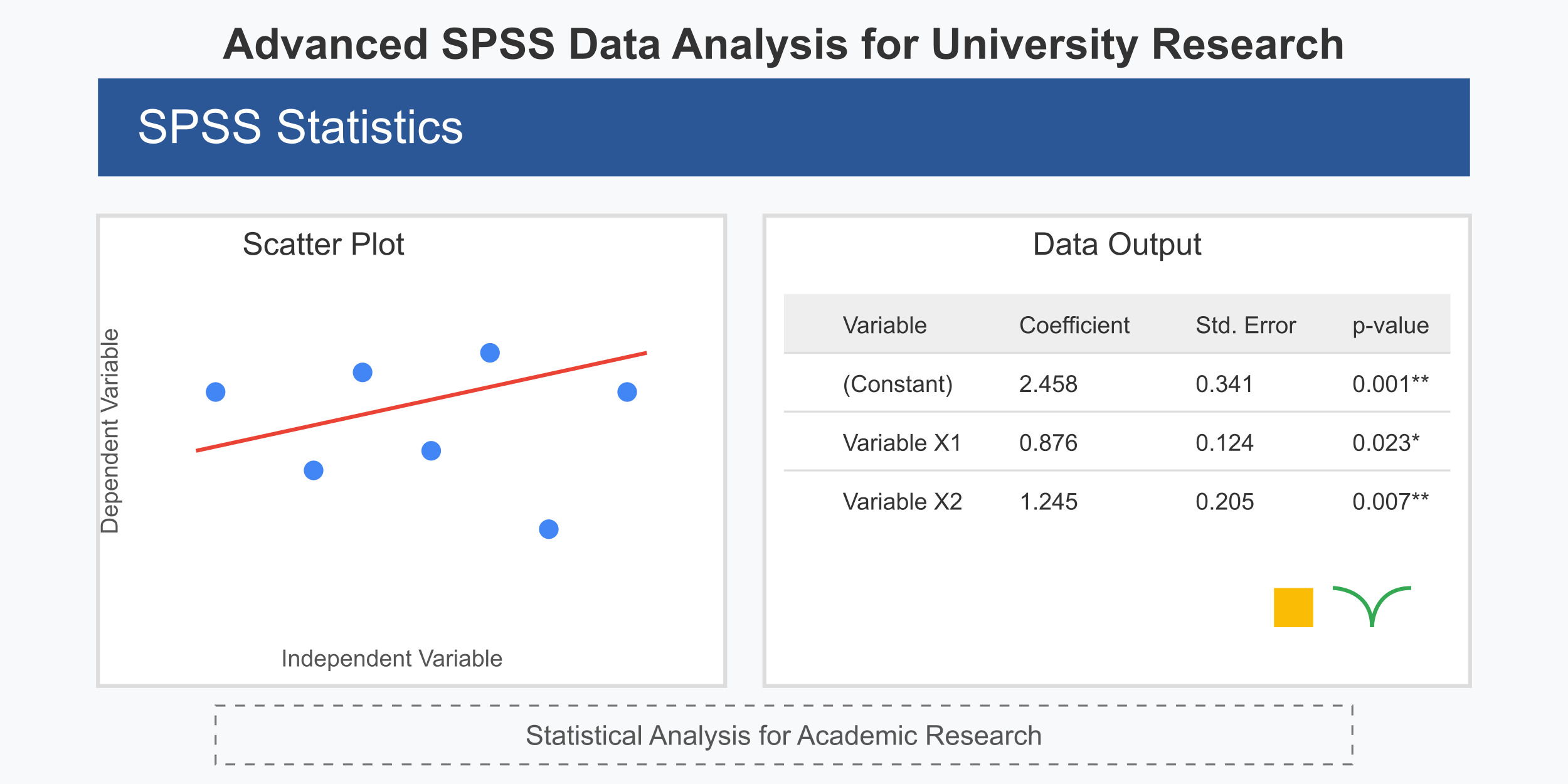
When you’re looking to go past the basics, you need to start exploring more sophisticated visualizations. SPSS provides a suite of tools that let you create layered charts and graphs that can communicate more complex stories. For example, scatterplots aren’t just dots on a graph—they can be enhanced with trend lines, confidence intervals, and even multiple regression overlays that help you tease out relationships between variables.
Another cool trick is using cluster analysis visuals. Instead of just seeing a jumble of data points, you can actually start grouping them into clusters that reveal hidden patterns in your research. This is especially useful in social sciences or market research where segmentation can make or break an argument. It’s like when you’re at a party and suddenly see all your old buddies huddled in one corner – spotting those groups can tell you a lot about the vibe of the place.
I remember a time when I was working on a project and needed to show how different demographics responded to a particular marketing campaign. The standard pie chart just wasn’t cutting it. So, I decided to create a layered bar chart with multiple segments and even tossed in a line graph overlay. It turned out to be a game changer, giving my audience a much clearer picture of the trends. And yeah, sometimes it feels like you’re reinventing the wheel, but trust me, once you get the hang of these customizations, your visuals will have that extra spark.
The Nitty-Gritty of Customization
Alright, let’s get into some nitty-gritty details. Customizing charts in SPSS is both an art and a science. On one hand, you have to understand your data and what you want to highlight. On the other hand, you need to know your way around SPSS’s graphical interface, which can sometimes be as confusing as a map without any landmarks. For instance, adjusting the scales or reassigning variable labels might require a few clicks in the “Chart Editor,” and if you’re not careful, you could end up with a graph that’s more cluttered than a New York City subway at rush hour.
One nifty feature is the “Chart Builder” tool. This handy little utility lets you drag and drop elements to create custom charts without needing to write a single line of code. But if you’re feeling a bit more adventurous, you can also dip your toes into syntax editing. It’s kinda like choosing between taking a scenic route or driving straight to the destination—both will get you there, but one might show you a few hidden gems along the way.
And hey, if you ever find yourself stuck, there’s a whole community out there ready to lend a hand. I mean, sometimes a quick online search for “Do My SPSS homework” can lead you to forums, tutorials, and even video guides that break down these advanced techniques in a way that’s super approachable.
Why Go Beyond Basic Charts?
You might be wondering, “Why bother going beyond the default charts?” Well, here’s the deal: in research, it’s not just about crunching numbers—it’s about telling a story with your data. A well-crafted chart can make your findings more accessible and even persuasive. When you present a sleek, customized graph, you’re not only showing that you understand the data, but also that you respect your audience enough to give them something visually appealing.
Moreover, in today’s competitive academic and business environments, standing out is key. Imagine you’re pitching your research findings to a room full of experts. A plain bar chart might get the job done, but a visually compelling, layered graph can grab attention and spark a conversation. It’s the difference between “Oh, cool, that’s interesting” and “Whoa, I gotta know more about this!”
Off on a Tangent: The Evolution of Data Visualization
I know, I know—this might seem like a bit of a tangent, but bear with me. Data visualization isn’t just a fancy tool for making reports look pretty; it’s a whole field in itself that’s been evolving over the decades. Back in the day, scientists were scribbling on paper and using rudimentary charts by hand. Fast forward to today, and we have tools like SPSS that let you build interactive dashboards and real-time data visualizations.
The journey from paper to pixels is kinda like the evolution of music—from vinyl to streaming. There’s a richness in knowing where you came from, even if the new methods are a lot more flexible and engaging. And while SPSS might not have all the bells and whistles of some newer data visualization platforms, it holds its own by offering a balance of familiarity and powerful features.
Practical Tips for Enhancing Your SPSS Visuals
So, what can you do to really make your SPSS graphs shine? Here are a few down-to-earth tips:
- Play With Colors: Don’t be afraid to experiment with color schemes. Sometimes, a pop of color can bring a graph to life, but be cautious—too many colors can make your chart look like a hot mess.
- Layer Your Data: Consider using multiple layers to showcase different aspects of your data. For instance, overlay a trend line on a scatterplot to highlight correlations.
- Simplify Where You Can: More isn’t always better. If your chart gets too cluttered, take a step back and simplify. It’s all about striking that perfect balance between detail and clarity.
- Use Annotations: A little text or a note can sometimes do wonders in guiding your audience through your chart. Don’t hesitate to add callouts or labels that make your graph easier to follow.
- Try Out Interactive Elements: If you’re feeling bold, explore options for creating interactive charts that let users hover over data points for more info. It’s like giving your audience a little treasure hunt in your data.
Overcoming Common Hurdles
Now, let’s be real for a sec—working with SPSS isn’t always a walk in the park. Sometimes the software can be a bit finicky, and you might find yourself scratching your head over why a certain option isn’t working as expected. When that happens, take a deep breath and remember that you’re not alone. There are plenty of tutorials, online forums, and even fellow researchers who’ve been in the same boat.
It’s also important to keep in mind that no tool is perfect. Even when you get that fancy, customized chart looking just right, there might be minor issues that you’d rather ignore than spend hours trying to fix. And that’s totally okay! In the real world, sometimes “good enough” is really good enough. Ain’t nobody got time to be a perfectionist all the time.
Final Thoughts
At the end of the day, visualizing research data in SPSS is all about making your findings accessible and engaging. Sure, the default charts and graphs have their place, but once you start exploring beyond those basics, you’ll find that there’s a whole world of possibilities waiting for you. With a bit of creativity and a willingness to experiment, you can transform even the most mundane dataset into something that really tells a story.
So, if you’re ready to step up your game and dive into the nitty-gritty of advanced SPSS visualizations, don’t be afraid to get your hands dirty. Experiment, make a few mistakes (we all do), and most importantly, have fun with it. After all, research is not just about the numbers—it’s about the journey of discovery, and every chart is just another stepping stone along that path.
Thanks for hanging out with me while we explored the ins and outs of SPSS visualizations. Keep pushing the envelope and let your data do the talking, even if it means stepping outside the comfort zone of basic charts and graphs.
About the Author:
Hey there, I’m Alex, a data enthusiast working with New Assignment Help. I’m all about making research a bit more approachable and fun, whether it’s through cracking a tough SPSS problem or just sharing some cool data viz tips. When I’m not buried in numbers, you’ll probably find me catching up on the latest baseball game or just chillin’ with a cup of joe.


Leave a Reply